


Common Website Mistakes That Drive Visitors Away
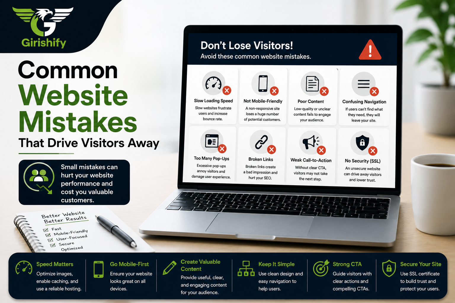

Your website is your digital storefront. Get it right, and you instantly win trust. Get it wrong—even in small ways—and people will bounce to a competitor before they even see what you offer.
Too often, we get caught up in flashy features and forget the basics. The good news? The biggest mistakes are incredibly easy to spot and fix.
If your website isn’t turning visitors into customers, check if you’re making any of these critical errors.
1. It loads way too slow.
If a website takes longer than two or three seconds to load, users click away to another tab. This often results from a person uploading large images right off a camera without compressing them, or when a website is hosted on a budget plan unable to support heavy traffic.
2. It looks broken on a phone.
More than 50% of a website’s traffic visits using smartphones. If a text is small, there are overlapping buttons and users need to pinch and zoom just to read a single paragraph, then they will simply close it. The website should adapt itself according to which device a user opens it on, whether a desktop or a mobile screen.
3. Its menu is difficult to understand.
People should not have to search for what your company does and how to work with you. Having too many items and strange names on the top menu causes a person to be puzzled. Make the navigation easy to use.
4. It seems abandoned.
Having a “Latest News” section and updating it a few times three years ago, or having an outdated copyright year in the footer of the website shows that the company is not working anymore. Such mistakes can be easily avoided by a monthly check.
5. It hides the contact information.
The customer who is ready to hire you does not need to go through three pages to reach the phone number. The website should show its email, telephone number and location in a prominent place, such as a header or a footer.
6. There is no call-to-action.
When a user reaches your website, they need to know what you expect them to do. Otherwise, it will result in lost potential customers. Use a bright button with an obvious name such as “Get a Quote” or “Book a Call”.
7. Giant walls of text.
Websites are not novels and should not be read in the same manner. Having huge text blocks on the home page is a sure way to make the user ignore them. Instead, use short two-sentence paragraphs, bold headlines and bulleted lists.
8. Bad quality graphics and blurred logos.
Stretching the logo or posting low-quality pictures and stock images will make the website appear to be amateur. Using good quality graphics automatically improves the appearance of the whole business.
Lack of Website Security
Modern browsers will literally warn users if your site isn’t safe. If your URL doesn’t start with HTTPS (meaning you don’t have an SSL certificate), a “Not Secure” warning will pop up. Keeping your system updated and secure makes your clients feel safe doing business with you.
Final Thoughts
You don’t need a massive budget or a complicated layout to have a great website. You just need a digital space that loads fast, works beautifully on a phone, and gives people the info they need without making them work for it. Put yourself in your customer’s shoes, fix the friction points, and you’ll see a massive difference.