

Your Website Is Your First Employee—Is It Doing Its Job?
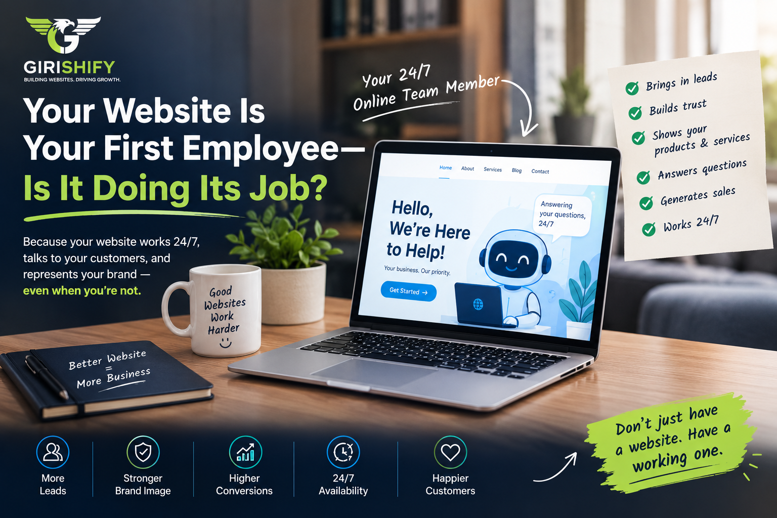

If you run a business, you know what happens when a team member isn’t pulling their weight.
If an employee shows up looking messy, ignores walk-in customers, or takes ten minutes just to answer a basic question, you don’t let it slide. You fix the issue or you let them go.
Now, take an honest look at your website.
Your website is the very first worker a new customer runs into. It stays open 24/7, never takes a holiday, and talks to more potential buyers than anyone else on your payroll.
The real question is: is it bringing in sales, or is it scaring people off?
1. Does It Make a Clean First Impression?
People make up their minds about your business in about two seconds flat.
If your site opens with blurry photos, weird spacing, tiny text, and menus that don’t make sense, visitors assume your work is sloppy too. They hit the back button and head straight to your competitor.
A great website looks sharp immediately. The branding is clean, the text is easy to read, and it instantly tells visitors, “We know what we’re doing, and your money is safe with us.”
2. Does It Explain What You Do in Plain English?
Nobody likes dealing with someone who talks around in circles.
A lot of websites are packed with confusing lines like “we optimize integrated workflow paradigms.” That means nothing to a normal person.
Your homepage should answer three simple questions before someone even scrolls down:
What do you actually sell?
Who is it for?
How does it make life easier for the customer?
Keep it simple. Say what you do right at the top so people don’t have to guess.
3. Does It Make People Wait Around?
If you walk into a store and the person behind the counter ignores you while you wait around, you leave.
Online, people have even less patience:
If your pages take more than two or three seconds to open, visitors are gone before your logo even loads.
Sluggish sites usually come from uncompressed, giant photos and a pile of clunky, outdated plugins.
When a site is built with lean code and clean CSS, pages snap open instantly on both laptops and phones.
4. Does It Work Properly on a Phone?
Most people looking up your business aren’t sitting at a desktop computer—they’re on their phones.
If someone opens your site on a smartphone and has to zoom in to read the text, or if buttons overlap so they can’t tap them, you just lost a lead.
A site built on solid, responsive grids (like Bootstrap) automatically fits any screen. The text stays readable, the images scale smoothly, and your phone number is a one-tap call.
5. Does It Tell People What to Do Next?
A good salesperson doesn’t just stand there silently hoping someone buys something. They show the customer the next step.
If your web page ends with a wall of text and no clear button, people will just close the tab.
Use bold buttons with clear instructions:
“Get an Estimate”
“Book a Free Call”
“Message Us on WhatsApp”
Make it dead simple for someone to take the next step.
Time for a Quick Performance Review
Ask yourself these five simple questions about your site:
Speed: Does it load in under 3 seconds on your phone?
Clarity: Can someone figure out what you sell in 5 seconds?
Mobile: Does it look natural on a phone without zooming?
Contact: Is your phone number visible on every single page?
Action: Are there clear buttons telling people how to hire you?
The Bottom Line
Your website is either working hard to bring in calls, or it’s quietly losing you money while you sleep.
Turning a slow, confusing website into an active lead generator doesn’t mean you have to make things complicated. It just takes clean code, fast loading speeds, and straightforward design.
If your website isn’t pulling its weight, the team at Girishify builds fast, clean custom layouts that look great and actually bring in business.